PepsiCo just unveiled a new nostalgic logo, and it might look familiar to long-time fans of the bubbly beverage. The new logo is a slightly modified version of the one last used in the 1990s. The soda brand said the changes are meant to connect Pepsi's past and present.
"We designed the new brand identity to connect future generations with our brand's heritage, marrying distinction from our history with contemporary elements to signal our bold vision for what's to come," said Mauro Porcini, chief design officer of PepsiCo, in a press release.
While the fonts and font color are different, and a new border has been placed around it, the basic design of the logo is a throwback. The Pepsi brand name is set between a red and blue ribbon, rather than next to it, as in the most recent version.
"Pepsi is an iconic brand that is constantly evolving with the times, as it has been a staple in pop culture and disrupted the category for the past 125 years," said Todd Kaplan, chief marketing officer at Pepsi. "This new visual system brings out the best of the Pepsi brand's rich heritage, while taking a giant leap forward to set it up for success in an increasingly digital world."
Amanda Chin, SVP of Marketing for the Golden State Warriors, stops by Cheddar to debut Valkyries name and logo and talks why women sports is good for business.
The return of ‘meme stocks’ don’t mean it’s time to panic about the stock market. If you want something to worry about… look no further than inflation.
Andela is revolutionizing global work for a sustainable future. Their impact includes diverse skills, income growth, & successful hiring in untapped locations.
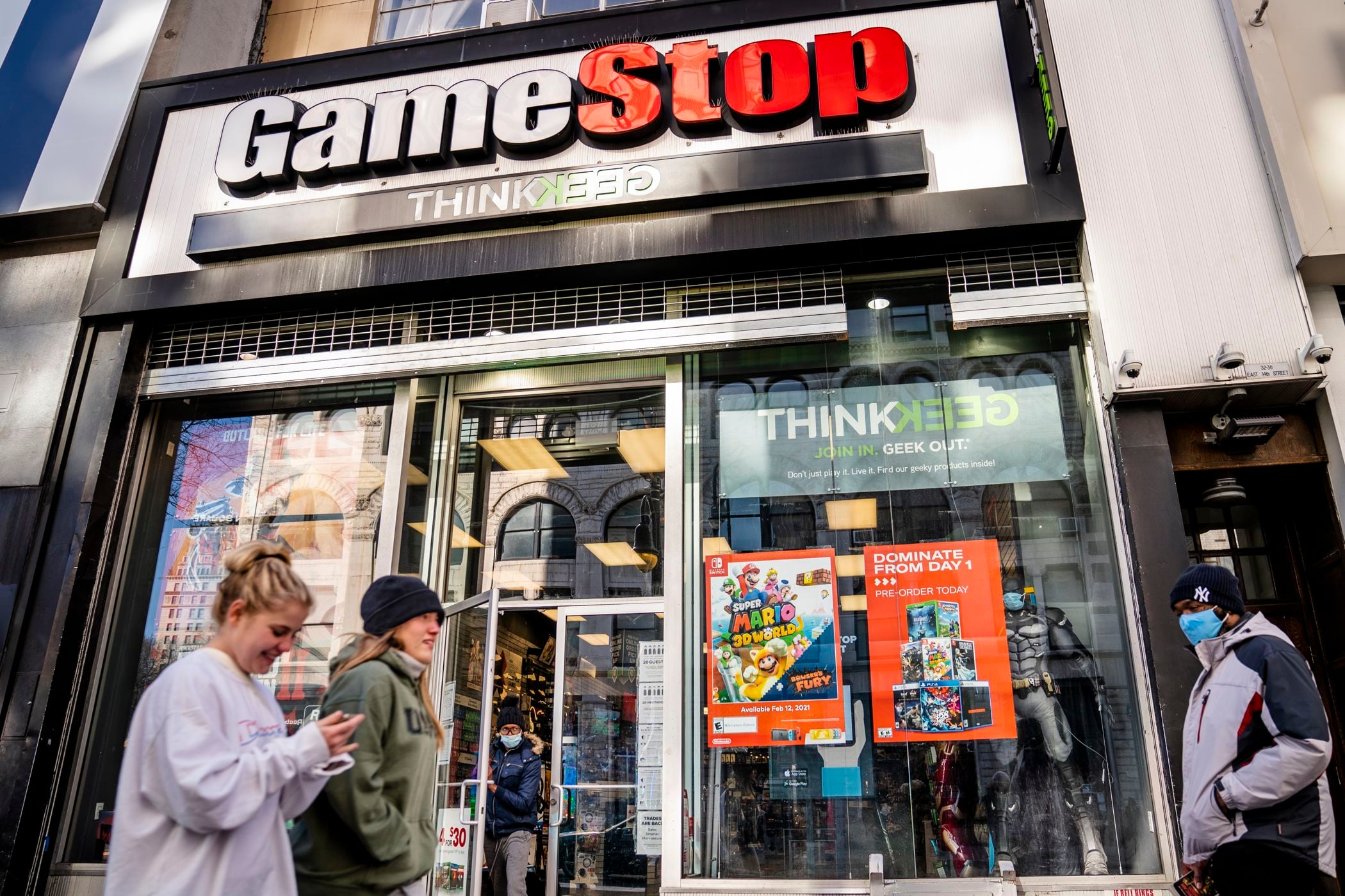
With Gamestop and other meme stocks back on the rise, it brings to mind some similarities between 2021 and 2024 economically… and that’s not necessarily good.